The MIA expansion is not about the building
Go Deeper.
Create an account or log in to save stories.
Like this?
Thanks for liking this story! We have added it to a list of your favorite stories.

As Director Bill Griswold strides through the new wing of the Minneapolis Institute of Arts, his enthusiasm is apparent.

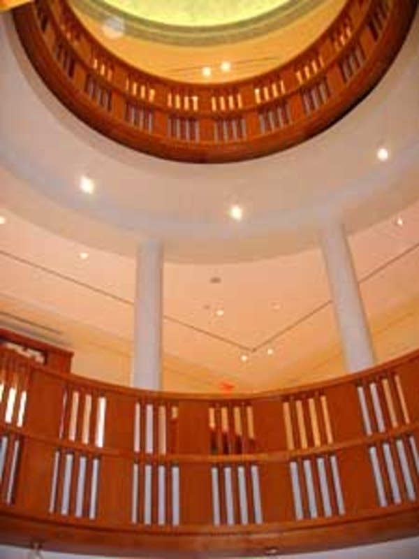
"Here's a marvelous vista, a whole suite of new galleries, beautifully proportioned spaces, that allow us to show much more of our collection than before and to show it more spaciously, more graciously than ever before," says Griswold. "We're all really thrilled about the building, and what it represents and what it does for us."
The expansion adds 34 new galleries to the institute as well as a new classroom, an art library, and public archives of prints and photographs.
Griswold came to the MIA last October. The Institute was already well along in its expansion, as guided by Griswold's predecessor, Evan Maurer. Under Maurer's direction, the MIA became free to the public and a much more welcoming place for children and families.
Turn Up Your Support
MPR News helps you turn down the noise and build shared understanding. Turn up your support for this public resource and keep trusted journalism accessible to all.

Griswold says the expansion of the building is a natural extension of that vision.
"The key word for the new building is access," says Griswold. "This provides greater access to our permanent collection, it provides greater access to the parts of our collection which for one reason or another cannot always be on view. It provides greater space for temporary exhibitions, thus providing access to works that are on loan from other institutions. And so this is a facility that will make more art accessible to more people than ever before in our history."
To understand the impact of the new wing, consider the museum's textile collection. Curator Lotus Stack oversees a collection of more than 10,000 textiles, but she's been able to hang only a few of those pieces at a time in the institute's hallways. Now she has four entire galleries to herself.

"It feels like I've landed in Utopia, I mean what else can you ask for?" laughs Stack. "It is a frustration of probably every curator, some more than others depending on the size of your collection -- how much you can share with people, not only to represent the collection, but to give it context to give it greater meaning and relationships. And exhibitions, after all, are about relationships. The whole building is that way, so it's thrilling for us all."
The MIA's expansion has had a ripple effect throughout the building. Every gallery has been reorganized, the art re-hung. As a result, the paintings, sculpture, and prints that adorn the MIA's now 143 galleries seem to breathe more easily.
Gallery owner and former MIA trustee Martin Weinstein says the expansion, viewed from the inside, is a success.

"For me the real test is, does the building afford a space in which art can be displayed in its fullest and best fashion?" says Weinstein. "I believe the institute, because of the addition, is able now to display objects in a much finer fashion than it could have done before."
Weinstein says viewers should feel good inside the museum, even as they're challenged by the art. The space should enhance their interest, and their ability to remember what they've seen. Weinstein says he experienced this himself, with a 17th-century portrait of the virtuous yet ill-fated Lucretia.
"I sat down in my most recent tour and just looked up at Rembrandt's painting of this sweet, innocent young woman, and I was so taken with it," says Weinstein. "I think that's one of the best Rembrandts anywhere. I don't think I ever focused on it as much as I did this last time."

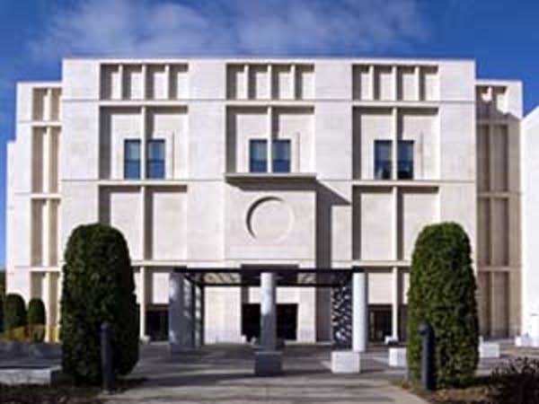
The new Target wing of the MIA was designed by architect Michael Graves. It now joins with the architecture of McKim, Mead and White, who created the MIA's original 1915 neo-classical building, and Japanese architect Kenzo Tange's modernist additions of the 1970s. Combined, they create a U-shaped building that encloses a small, restful park.
Despite his love for the artwork and his happiness with the new interior, Weinstein says the exterior of the Michael Graves wing leaves him dissatisfied.
"I'd like it to be warmer," says Weinstein. "I would like it to maybe reflect more of what's inside. I felt it was cold and a bit heavy."
Weinstein is not alone. Signs on neighborhood houses protest the expansion as a big, white, boring box.
Michael Graves has an often-debated reputation in the architecture world. Rumors have floated around in the arts community that the expansion's funding by Target Corp. was conditional to the MIA choosing Graves, who's perhaps best known for designing home products for Target stores. Director Bill Griswold denies the claim.

"It was not, it was not," says Griswold. "Target is the lead funder of this project, but we considered many architects. And Michael Graves, we felt, was the right architect for this building."
Griswold says Graves successfully melds the neoclassicism of the MIA's original building with the modern minimalism of the 1970s addition. But more important, Griswold says, Graves has created a space that allows the MIA to be even more dynamic and aggressive in its programming and its community outreach. Martin Weinstein says while he's not totally pleased with the new exterior, he's not too concerned about it.
"You're not going to stand outside and look at the building too much, says Weinstein. "You're going to be anxious to run inside and see what they have for you to see -- the artwork."
Weinstein says many museum expansions end up being all about the building. In the case of the MIA, he says, the expansion is all about the art.


