Why predicting COVID-19 is like forecasting with a broken weather model
Limited data inputs and rapid changes make predictions difficult
Go Deeper.
Create an account or log in to save stories.
Like this?
Thanks for liking this story! We have added it to a list of your favorite stories.
We’re living in unprecedented times in the world today.
Everyone is trying to figure out how COVID-19 will unfold. How many people will get sick? What are the short and longer-term social and economic impacts? It’s clear that accurately forecasting how coronavirus will ultimately evolve in the United States is highly uncertain.
As a meteorologist, it occurs to me that forecasting the eventual outcome of COVID-19 is like forecasting an incoming snowstorm with a broken weather forecast model.
It’s starting to “snow” in the USA. But the model forecast solutions for how much snow we will get are all over the map.
Turn Up Your Support
MPR News helps you turn down the noise and build shared understanding. Turn up your support for this public resource and keep trusted journalism accessible to all.
The storm
We know what the storm looks like. It’s a sudden, massive, severe system that first devastated China. We’ve watched the storm tear across South Korea. And then hit Italy with deadly force.
As I write this Friday, the storm is still expanding across Europe. New cases and deaths are still rapidly rising in many European countries.
We can track the approximate number of cases worldwide.
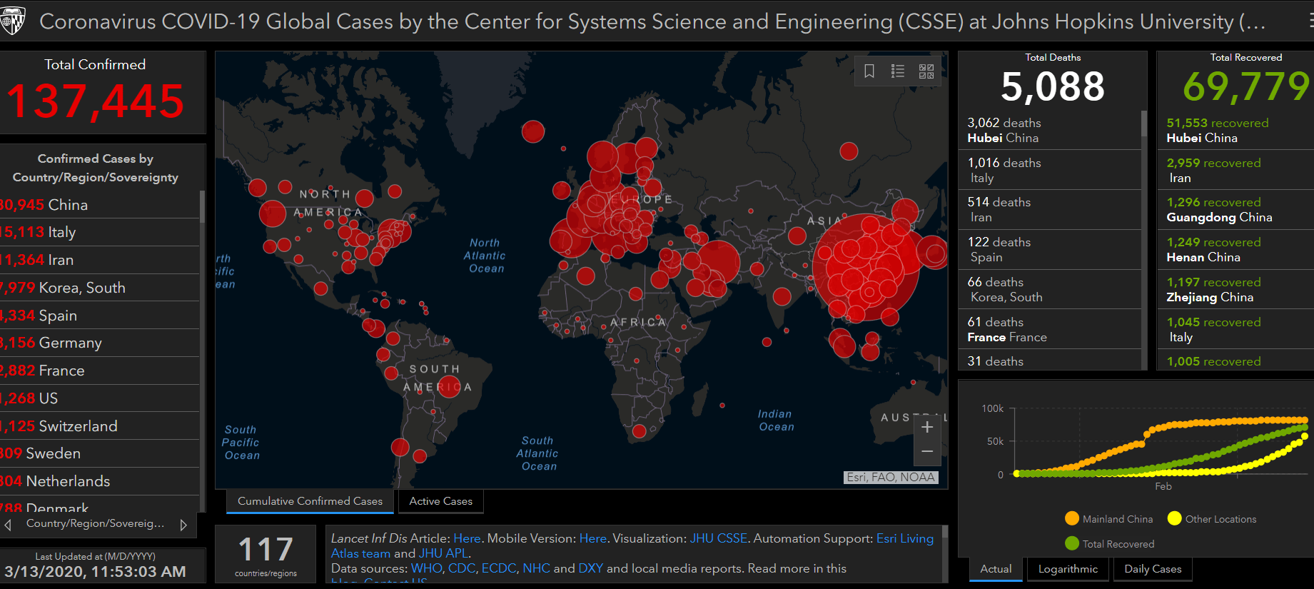
So, our global view on this storm gives us a decent picture of storm coverage, severity and trends. But there is still incomplete data in many areas.
USA forecast: Incomplete data input
So far our view of the inbound storm is less clear in the United States.
Think of COVID-19 test results as data reports from surface weather stations across the U.S.
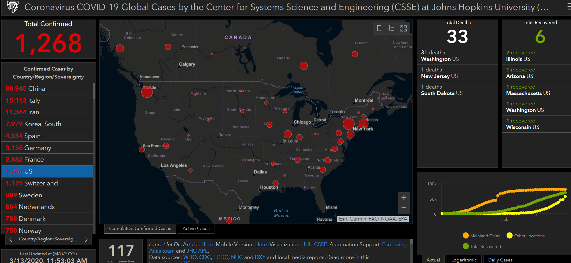
In the early phases of the virus spread, no COVID-19 tests were performed in the USA.
As testing began to happen, limited data began to arrive as input into the forecast model.
Test capacity is growing in the USA. But as of this week, data input from the USA still lags severely compared with other counties.
That means our ability to analyze our growing storm in the USA is lacking.
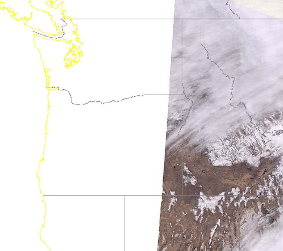
It’s like one of our weather satellites is down, and we can’t get a clear picture of what the storm looks like from above. We just can’t see the whole storm.
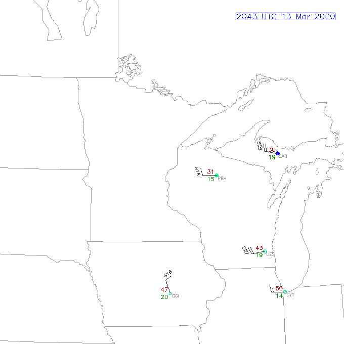
It’s like most of our surface weather observing stations are down. We can see a few data points. But we can’t draw an accurate surface map showing where the low-pressure center is located.
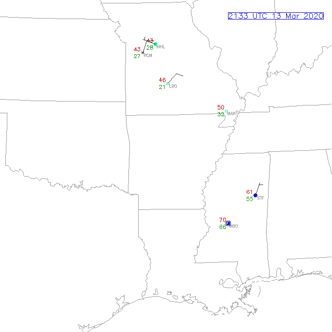
We can’t assess how big the storm is. We can’t see how strong the storm is or how fast it is strengthening.
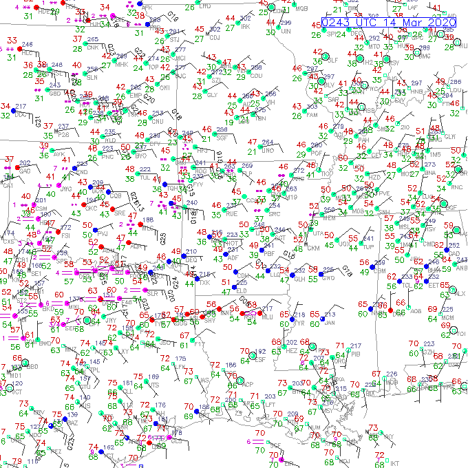
This is how much data we should see.
Uncertain storm track
The incomplete data means our forecast model is essentially broken.
We can’t tell precisely where the worst parts of the storm are now, or where they’re heading. We can’t see where it’s going or how fast it’s moving.
Will the worst “storm track” of community spread follow a certain latitude?
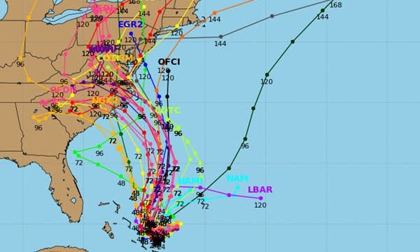
Our forecast model lacks enough data to create a confident storm track. The spaghetti plot of possible storm tracks, and possible impacts, shows great uncertainty.
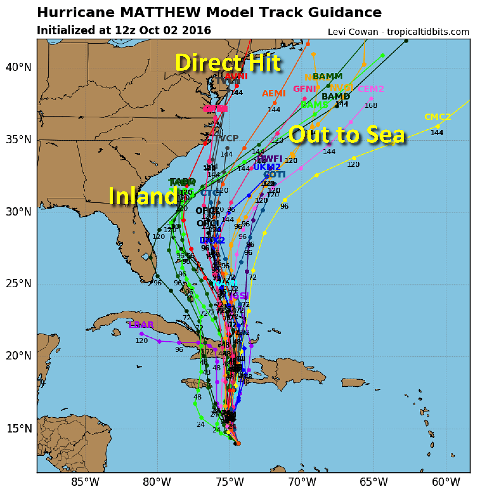
Wild forecast model swings: Like the markets
Forecast models create Model Output Statistics (MOS) based on predicted storm track and strength. MOS predicts snowfall outputs.
But the incomplete data going into the forecast model for the “COVID-19 storm” is incomplete. Even more, the extreme variability of possible outcomes based on differing data inputs makes the model crank out wildly different solutions.
Think of the snowstorm analogy again.
One incomplete data input suggests a massive moisture surge, plenty of cold air and a perfect storm track for heavy snow. In that case, this storm could bury us under two to three feet of snow. It could be worse than the 1991 Halloween mega storm. It could be the storm of the century.
But another incomplete data input suggests a previously unforeseen dry slot will cut off the moisture source. Temperatures within the storm will be a few degrees warmer, and much of the precipitation will fall as rain. The storm will track a hundred miles further north, greatly reducing snowfall totals. We end up with a few flurries and a light snowy coating.
The difference between boom or bust snowfall totals depends on changing just a few variables. That produces wild run-to-run forecast model swings, as different data inputs cause wildly different forecast outputs.
Financial market whiplash
In our current context, we can think of those the wild forecast model output swings as the reaction of financial markets. Markets make assumptions (forecasts) every day based on available data and likely outcomes.
Because the data on COVID-19 has been incomplete and changes rapidly, the markets react wildly to the latest set of assumptions. Because government policy and actions on COVID-19 response change suddenly, the markets react wildly to the latest changes and assumptions.
The financial stakes of the possible range of outcomes are extreme. That further fuels extreme volatility.
So, the markets react wildly in opposing directions based on the latest perceived outcomes. Because the data going into those forecasts changes frequently and severely, the market swings are extreme.
One forecast model run cranks out an inch of snow. The next one cranks out three feet.
Uncertainty reigns
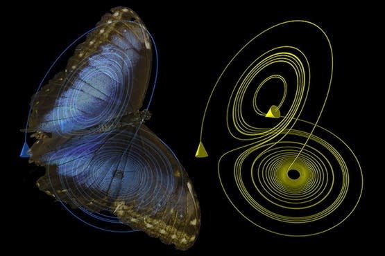
One thing that’s clear with COVID-19 in the USA. There is still a high level of uncertainty as to how this will ultimately unfold. Chaos theory dictates that even small changes in initial input can produce large differences in outcome.
It’s the butterfly effect. A butterfly can theoretically flap its winds in China and cause a hurricane in the Atlantic.
We don’t yet know how many cases will ultimately occur. We don’t know the rate of community spread. We don’t know how much actions like social distancing will starve the COVID-19 storm of available moisture and reduce transmission. We don’t know how long the storm will last. We don't know if summer will have an impact on reducing virus transmission. We don't know if it will return next fall and winter.
We don’t know how quickly we will be able to flatten the curve here in the USA.
So as you asses your risk and preparations, keep this in mind: Accurately forecasting the eventual evolution and severity of COVID-19 in the USA is still highly uncertain. There is still a lack of available data today.
It’s like forecasting an inbound snowstorm with a broken weather forecast model.
You can’t control how much snow will eventually fall at your house. But you can control how well you will be prepared. And you can reduce the risk that the storm will produce severe impacts in your city and neighborhood. And you can take care of your family, friends, and neighbors by sharing information, and providing emotional and other kinds of support.
And of course, we can all maintain a sense of humor.
This storm will pass. We just don’t know how bad it will be. And we don’t yet know when it will end.


